Categories
By PPCexpo Content Team
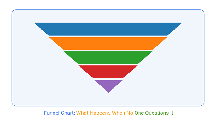
A funnel chart looks calm. It shows clean, tapered stages. It feels neat. But neat doesn’t mean honest.
The funnel chart hides noise, delays, and bad data behind its perfect shape. Users drop off, tools break, clicks get faked, and yet the chart flows on like nothing happened. That smooth flow? It often skips the rough parts, the parts that matter most.
The biggest risk? Everyone believes it. Executives nod. Teams align. No one questions the gaps, the assumptions, or the logic. The funnel chart becomes the truth, even when it isn’t.
Funnel chart issues start before the data even arrives. Sometimes, the shape is picked first, then the numbers are forced to fit. Funnel chart stages get deleted to make slides shorter. Numbers get padded to hit quotas. Form abandonments vanish. Tracking glitches pass as progress.
Funnel chart metrics don’t always match what finance, product, or marketing teams see. One chart, three truths, no trust. Yet it’s the chart everyone watches.
A funnel chart can be useful, but only if you treat it like a suspect, not a solution. Question every stage. Check every spike. Validate the meaning behind the movement. Because if the funnel chart looks too good to be true, it probably is.
Funnel charts look like the trusty sidekick you can count on. But, beneath those tidy visuals, a lot is happening that you can’t see at first glance. They offer a simplified view of conversion processes, but that simplicity is often their downfall. While everything seems stable, there’s a good chance you’re overlooking critical details that could cost you trust and clarity.
The real danger lies in the false sense of security they provide. When you look at a funnel chart, you assume it’s telling the full story. But often, it’s not. It smooths out the bumps, making everything seem more predictable than it really is. This false calm is where the trust starts to erode. Without realizing it, you’re making decisions based on incomplete data, and that’s a risky game.
At first glance, a small dip in the conversion flow might not set off alarms. But that’s where these visualizations trick you. They flatten significant conversion drops into seemingly minor attrition. It’s like putting on rose-colored glasses; the problem looks less severe than it is. The real issue? You miss the friction points that are causing hesitation or dropout.
Critical behavioral data gets buried under this visual stability. When calls to action aren’t clear or when the process feels clunky, people hesitate. But the chart doesn’t shout about it. Instead, it whispers, making those dips easy to dismiss. It’s this very simplicity that glosses over the real friction happening underneath.
Teams often change stage criteria without a second thought. This slow drift in definitions breaks the comparability of your funnel over time. What was once a solid benchmark becomes a moving target. You still see a shape, but it’s not the same funnel you started with.
These shifts make performance comparisons almost impossible. The funnel looks unchanged, but its integrity is compromised. The outcome? You think you’re tracking progress, but you’re comparing apples to oranges. It’s a subtle shift that’s easy to miss until it’s too late.
Labels are tricky. Mislabeled or inconsistent conversion events can make a mess of your data. Whether it’s inflated by tool defaults, misfired tags, or overly optimistic definitions, these inaccuracies make the chart untrustworthy. You think you’re measuring one thing, but in reality, it’s something else entirely.
These misleading labels cloud judgment. You can’t be sure which behaviors are genuine and which are just noise. This uncertainty breeds doubt, and before you know it, the chart becomes a guessing game rather than a reliable tool. It’s not just about the numbers; it’s about understanding the real story behind them.
Visuals can be deceiving. When it comes to funnel charts, they often present a polished image that hides messy data. These charts clean up the rough edges, rounding numbers, interpolating data points, and formatting everything to look just right. It’s like putting a fresh coat of paint on a crumbling wall. The chart looks neat, but it’s not telling the whole story.
But beneath that smooth surface, there’s chaos. Sharp drops in data might be smoothed over, giving a false sense of stability. It’s like a calm sea hiding a storm beneath. This fake calm can be dangerous. It kills the urgency needed to address real problems. When everything looks fine, no one rushes to fix it.
You might think that a funnel chart is your ally, showing clear paths and easy transitions. But most visualization tools are like magicians; they hide the complexity behind a curtain. They’ll smooth out a sharp drop just enough so it looks like a gentle slope. This sleight of hand makes everything feel explainable and under control.
Why does this matter? Because this false sense of calm can lead to complacency. You don’t feel the need to act until it’s too late. Urgency dies, and with it, the drive to solve underlying issues. The chart might soothe nerves in the boardroom, but it’s lulling you into a false sense of security.
Widths in funnel charts can be tricky. They often transition smoothly, making everything appear predictable. But that symmetry is misleading. It suggests that conversion falloffs are natural and expected. In reality, buried friction could be wrecking your results, but you wouldn’t know it by the chart’s looks.
So, what’s the trick? Look for asymmetry. It’s a signal that something’s off. When you spot uneven widths, it’s not just a visual quirk. It’s a warning sign. It points to hidden stage friction that needs your attention. Don’t trust the smooth lines, dig deeper.
Time is a sneaky thief in the world of funnel charts. Most charts omit critical time-to-convert metrics. You see a healthy flow, but what’s missing? The timing. Conversions might appear steady, but without velocity data, you’re blind to slowdowns. The chart looks healthy, but timing could be collapsing.
This omission has real consequences. Revenue might be slipping through the cracks, unnoticed until it’s too late. A flow that seems robust could be hiding a ticking clock. Without time metrics, you’re navigating blind, making decisions on incomplete information. It’s a gap that can cost you.
The following video will help you create a Funnel Chart in Microsoft Excel.
The following video will help you create a Funnel Chart in Google Sheets.
Have you ever noticed how some things just sneak by unnoticed? That’s a funnel chart for you. It sits there, looking all neat, while behind the scenes, it’s harboring secrets. Problems that don’t scream, but whisper. This quiet erosion is where your data integrity starts slipping. You think everything’s fine, but underneath, it’s a different story.
When you’re not paying attention, these whispers turn into shouts. And by then, it’s too late. You’ve lost revenue, trust is shaky, and you’re scrambling to catch up. The stakes are high, and the cost of not catching these whispers early is steep. It’s all about shining a light on those shadows before they turn into monsters.
Oh, the joys of agile development. One week, your team decides to remove a feature. Next, they collapse some steps in the process. But did anyone update the event tracking? Nope. So, while you’re staring at your funnel chart, thinking everything’s peachy, it’s reporting a process that doesn’t even exist anymore. It’s like watching a ghost.
This ghost process can haunt your metrics. You think you’re seeing real-time data, but it’s just a mirage. Decisions based on this can lead you down a costly path. You need to ensure event tracking aligns with process changes. Otherwise, you’re just playing a guessing game with your data.
You look at the top of your funnel, and it’s buzzing with activity. Leads are pouring in. But before you celebrate, take a closer look. The volume at the top is masking a nasty truth at the bottom. The quality has nosedived, but the funnel chart makes it look like business as usual. The shape might survive, but the intent is long gone.
This illusion of continuity can be a real trap. You’re lulled into a false sense of security, thinking your pipeline’s healthy. But when you dig deeper, you find that the leads aren’t converting into anything meaningful. It’s like filling a bucket full of holes. The excitement at the top doesn’t translate into success at the bottom.
Imagine watching a pot boil. Everything seems fine until it overflows, and you’re left to clean up the mess. That’s conversion lag for you. Your funnel chart might show smooth progression, but behind the scenes, the time-to-close is stretching like taffy. By the time you notice, your forecasts have gone stale, and no one can explain the mess fast enough.
This stealthy lag can derail your strategy. It’s the kind of thing that sneaks up on you, hidden in plain sight. When it finally hits, you’re left scrambling to recalibrate. The challenge is catching this lag before it turns into a full-blown crisis. Keep an eye on your timing metrics because the funnel chart won’t tell you until it’s too late.
Different teams, different lenses. Picture a marketing team cheering over a spike in MQLs, while the product team groans over a drop in onboarding success. Both groups are staring at the same data, yet drawing polar opposite conclusions. This isn’t just a case of differing priorities; it’s about the lens each team uses to interpret the numbers. Marketing sees growth as more leads flow in, while Product sees cracks in the user experience. The same data, yet two stories. It’s like watching a movie with subtitles in different languages; everyone thinks they’re getting the full story, but are they?
The rift doesn’t stop with marketing and product. Sales might see a steady stream of potential deals, yet customer service notices a spike in complaints about usability. Each team interprets the data based on its own goals, which means alignment is more myth than reality. It’s like a group of people looking at a rainbow; everyone sees the colors differently based on their angle. The data might be clear, but clarity isn’t universal.
Marketing sees those rising MQLs, more leads, more potential. It’s an easy story to tell. But for Product, each new lead is another chance for user experience to falter. They see a different picture entirely, worrying about whether new users will stick around. It’s a classic case of two sides of the same coin, but one side’s shiny while the other’s dull.
The product’s focus is on the journey, not just the destination. A user might start strong, but if they drop off before the aha moment, Product feels the pain. Meanwhile, Marketing’s metrics are ticking upwards. They’re not wrong, just seeing through a different filter. It’s like watching two people argue about the weather from inside versus outside the house; both are right, but their experiences don’t match.
Shared stages like “Engaged” or “Qualified” can seem like neutral ground, but they’re battlegrounds for ownership debates. Everyone thinks they know what these terms mean, yet no one truly owns them. It’s a handoff that’s anything but clear, leaving teams to assume rather than confirm. If you can’t pinpoint who’s responsible, how can you fix issues when they arise?
This lack of ownership isn’t just a nuisance; it disrupts flow. When everyone’s in charge, no one is. Stages remain ambiguous, with each team interpreting them based on their own needs. It’s like a game of hot potato where no one wants to hold the spud. Clear ownership can transform chaos into order, but getting there requires more than assumptions.
Product, sales, and marketing all have different incentives, which means they often pull in different directions. One team pushes for speed, another for quality. The result? A flow that’s anything but linear. It looks straightforward on paper, but the reality is a tug-of-war between competing priorities.
These conflicting incentives mean that what’s good for one team isn’t necessarily good for another. Sales might want to close deals quickly, but Product needs time to ensure everything works smoothly. Marketing, meanwhile, just wants more eyes on the product. It’s a balancing act with no easy answers, where alignment feels like a moving target.
Data’s a funny thing. One day, it tells you everything’s fine, the next, it’s like a ghost story. Backend changes can do that. Field logic shifts, merged values, and redefined timestamps all play their part. The chart stays stable, yet the truth has changed.
You think you’re looking at a steady flow, but it’s a mirage. The historical flow? Rewritten without a whisper. This isn’t about breaking the chart, but how it reflects bad data decisions. The event funnel betrays you quietly.
Now your funnel shows a past that never happened. It’s like reading a book that keeps editing itself. You trust what you see, but it’s already wrong. CRM visualization can lead you astray.
Imagine waking up to find your house rearranged. That’s what happens when CRM changes go unnoticed. The funnel looks familiar, but it’s lying to you. Field logic and timestamps, once reliable, are now your adversaries. They’ve rewritten history, and you’re the last to know.
It’s not just a visual hiccup; it’s a silent threat. Your strategy, built on yesterday’s data, is crumbling. The funnel’s betraying you, showing a story that never was. It’s a trap, hidden in plain sight.
The ghost of past decisions haunts you. The familiar shape of the funnel is comforting, but it’s a façade. The CRM’s changes have altered your reality. Knowing this is the first step to regaining control.
Clicks are deceptive. Ever clicked something by accident? Funnels often translate clicks into intent. Auto-enroll flows, forced trials, misleading CTAs all inflate numbers. The chart sees progress, but it’s a false trail.
It’s like counting every passerby as a customer. The funnel’s optimism is misguided. You see growth, but it’s hollow. The behavioral funnel doesn’t ask why, it just assumes.
Misleading CTAs paint a rosy picture. The numbers seem to rise, but they’re empty calories. Progress isn’t just about numbers; it’s about genuine engagement. Without intent, those clicks are just noise in the data.
Neat funnels look great. They’re clean, simple, and completely misleading. Over-condensed stages erase the messy truth. No retries, no bouncebacks, just a sterile flow. But the user experience says otherwise.
It’s like a magician’s trick: what you see isn’t what you get. The chart looks smooth, but the path is rocky. Users struggle, but the funnel erases their plight. It’s all about looking good, not being real.
Behind those neat stages, chaos brews. The chart’s simplicity hides a world of frustration. Users are forced into a mold that doesn’t fit. The struggle is real, but the funnel refuses to tell that story.
Ever had a day where nothing goes right? Funnels ignore that. Repeated attempts, backtracking, retry loops, they vanish. The chart smiles at you, ignoring the struggle.
Executives see a clean path, but it’s a lie. The funnel pretends all is well, but users fight every step. The friction disappears, leaving a polished but false narrative. It’s a stage performance, not reality.
The struggle stays hidden, buried under a clean facade. The funnel’s silence is deafening. It’s the struggles we don’t see that hurt us most. The clean chart is a mirage, a false friend in a world of data.
Attribution can be a sneaky beast. Users appear in stage 2 or 3 without warning. The funnel accepts this, nodding along. It’s like inviting someone to a party and finding them already at the buffet.
The flow looks deliberate, but it’s not. Multi-touch attribution plays tricks on the mind. The funnel’s shape changes, and you’re left questioning reality. It’s a puzzle with missing pieces.
This isn’t just a quirk; it’s a flaw. The entry point is wrecked, and your data’s integrity with it. The funnel’s acceptance of these intrusions is its downfall. It’s a betrayal hidden in plain sight.
Visual design plays a sneaky role. It’s not just about aesthetics; it’s about how those aesthetics can mislead. Imagine a team meeting where the funnel is on display. Everyone’s nodding, thinking it’s all good. But is it? The visual might look steady, but beneath that calm surface, chaos is brewing. The problem is, they don’t see it until it’s too late.
Symmetrical designs are soothing. They scream stability and predictability. Everyone loves a nice, neat chart. But here’s the kicker: this neatness can be a big lie. When everything lines up too perfectly, it lulls stakeholders into a false sense of security. They assume everything is under control. But often, the reality is a lot messier. It’s like looking at a calm lake, not knowing there’s a storm brewing underneath.
A symmetrical funnel might suggest smooth sailing, but it often hides the rough seas. Stakeholders see the symmetry and think the drop-off is “normal.” It’s like training them to see calm when they should be spotting trouble. The truth is, if it looks too good to be true, it probably is. The real action, the real struggles, are often where the funnel breaks symmetry.
Color choice in charts isn’t just for flair. It’s a tool, and if used incorrectly, it can mislead. Imagine seeing a funnel where the middle stage is a muted gray. It’s easy to skip over, right? But that might be where the real story is. The most dangerous drop-offs often hide in plain sight, quieted by an innocuous color choice.
Boldness and contrast can direct focus, but they can also mislead. Bright colors scream for attention, while dull ones whisper. If the critical data point is gray text in a middle column, it’s overlooked. The quiet stage might be where things are going wrong, but without the right emphasis, no one notices. It’s a case of being too quiet about the important stuff.
Labels carry weight. They tell us what’s happening at each stage. But sometimes, they lie. Words like “Engaged” sound positive, but what do they really mean? Often, they’re just there to cover up a dip in performance. It’s a way to gloss over the truth with a shiny label.
Those positive labels soften the blow. They make the visual look better than it is. The funnel isn’t reflecting the truth anymore; it’s reflecting what you want people to see. It’s narrative management, not data transparency. When labels are vague, they hide the real story and keep everyone in the dark.
Time indicators seem helpful, but they can mislead. Average duration per stage sounds good on paper, but in reality, it adds noise. People start seeing time-to-convert as a measure of quality. But that’s a mistake. Time indicators can clutter the message, and the real insights get lost in the numbers.
Instead of clarifying, these indicators can muddy the waters. They make people think they understand the process when they’re just seeing part of the picture. The duration might seem like a solid metric, but it doesn’t tell the whole story. It’s about knowing when time matters and when it’s just another number.
You think your data’s got your back, showing you where things went wrong. But when conversion drops make their debut, you’re already in the danger zone. Two weeks, that’s how long it can take for reality to hit. And in those two weeks, you might’ve blown your budget or scrambled your strategy. Launch velocity? Poof, gone. It’s like running a race with a blindfold; by the time you see the hurdle, you’ve already tripped.
Ever watched a magic trick where the front looks fine, but behind the curtain, it’s chaos? That’s what stable entry volumes do to you. They lull you into thinking everything’s peachy while the later stages crumble. Without timing overlays, interpreting these charts can be like reading a book with half the pages missing. You need those overlays to see the whole story. Otherwise, you’re left with a narrative that sounds neat but hides the messy truth.
The moment of realization is like a slap in the face. Your chart updates, but it’s too late to react. Those conversion drops? By the time they’re visible, the damage is done. A two-week delay feels like an eternity when every day counts. In that time, budgets are misaligned, strategies go haywire, and launch plans hit a brick wall. The cost isn’t just financial; it’s a blow to momentum.
Think of it as trying to steer a ship after the iceberg’s been hit. The crew’s scrambling, but the water’s already pouring in. That’s what a two-week delay can do. It can sink your plans before they even set sail. In the fast-paced world of business, even a slight lag can mean the difference between staying afloat and going under.
The entry volumes look solid, almost comforting. But don’t be fooled. While the front of the pipeline seems to be holding up, the back end’s falling apart. It’s like a house with a beautiful facade but a crumbling foundation. Without timing overlays, you’re navigating without a map. You need those overlays to catch the decay before it spreads.
Imagine looking at the serene surface of a lake, unaware of the chaos beneath. That’s how these charts trick you. They present a linear story, a narrative that seems stable. But without a peek into the timing, you’re just seeing the surface, missing the turbulence below. Those overlays are the only way to get the full picture.
You’ve done the work, fixed the funnel stage. But where’s the evidence? The visual progress doesn’t show up fast enough. The clock’s ticking, and stakeholders want proof yesterday. It’s a psychological lag, a gap between action and validation. You’re left defending your corrections, hoping belief catches up with reality.
It’s frustrating, isn’t it? You know the fix is there, but without instant visual cues, trust hangs in the balance. Stakeholders need more than just your word. They need evidence. And when the visual lags, that evidence feels like a ghost. It’s there, but just out of reach. Convincing others becomes a waiting game, one that tests patience and credibility.
When you’re in the hot seat with executives, a detailed stage breakdown often looks like overkill. They see a multi-step flow and think you’re complicating things without reason. Their first thought? It’s padded. You need to be ready to explain each step’s value, why every stage is necessary, not just filler. Each step should be a decision point, not just a box to tick.
In the boardroom, misalignment can derail your presentation faster than you can say “conversion rate.” If your data tells one story but the sales team speaks another, credibility takes a hit. Before showing any visuals, align on definitions and expectations. Pre-meeting discussions can save face and keep your narrative intact.
Executives often crave simplicity. They see a detailed funnel and wonder why it can’t be as straightforward as a single line. Complexity feels like chaos. Questions arise: Is each stage vital? Prove its worth. Provide clear reasons why each stage exists and how it contributes to the overall goal. Each segment should serve a purpose, leading to critical decisions.
The challenge is making complexity feel like clarity. Too many stages can make it seem like you’re overcomplicating the process. But when you justify each phase, it transforms from clutter to clarity. Make sure every step has a clear, decision-driving purpose that aligns with your strategic goals.
When your charts show one thing and sales insist otherwise, you’ve got a problem. Data discrepancies lead to trust issues, and trust issues lead to doubt. The field team might see things differently, and their insights are invaluable. Before presenting, ground your data in their experiences to avoid surprises.
Mismatches between charts and field reports can undermine your position quickly. An unprepared team is a vulnerable one. Pre-align with sales, ensuring your data presentation doesn’t contradict their lived experiences. A united front in the meeting room means fewer surprises and more confidence in what you’re showing.
Presenting multiple funnels can paint a picture of division. Marketing might celebrate, while the product feels under fire. This split narrative can create tension, not insights. Your charts reflect numbers, not blame. It’s crucial to communicate that the data isn’t pointing fingers but highlighting different aspects of performance.
Multiple charts can suggest unequal success, leading to friction. Marketing sees growth; product sees challenges. This isn’t about setting teams against each other but about a balanced view. Clarify this in your presentation, so everyone understands the nuances and shares the same strategic goals.
Forecasts based on visual conversions might look spot-on, but they often miss the mark. They show a snapshot, not a prediction. Businesses relying on them for future insights often find themselves scrambling when unforeseen variables hit, like unexpected market shifts or internal changes that charts can’t predict.
Data-driven decisions should not rest solely on past visual cues. Charts assume static conditions, but reality is fluid. When the economic environment or consumer behavior shifts, sticking to a previous model can lead to misguided strategies and budget misallocations.
Ignoring the fluid nature of business dynamics leads to pitfalls. Relying on static visuals for forecasts can create a false sense of security. Businesses must adapt quickly to changing conditions, rather than clinging to outdated models that no longer reflect the current landscape.
When a report hits the table, it’s already dated. Charts show what has occurred, not what’s brewing on the horizon. Assuming that past patterns will hold leads to strategic blind spots.
The assumption of constant friction is misleading. Factors influencing customer behavior, market dynamics, and operational shifts are in constant motion. Sticking to outdated assumptions can lead to misfires and costly strategic errors.
Adaptability is key. Businesses need to anticipate changes rather than react to them. Relying on static data to project future outcomes often results in chasing errors rather than leading change.
Visual conversions often highlight a visible drop, but the real issue might lie elsewhere. A chart might flag a problem at a later stage, while the root cause actually lurks much earlier.
Focusing on the wrong stage can lead to ineffective solutions. If the initial engagement isn’t strong, any efforts on later stages won’t fix the underlying issue. Misidentifying bottlenecks results in wasted resources and efforts.
Businesses must dig deeper to find the real constraints. Addressing issues at the root, rather than where they visibly manifest, ensures more effective problem-solving and resource allocation.
Visualizations often imply a neat, linear path, ignoring the messiness of real customer journeys. Retention and re-engagement loops get lost, as if the journey ends with conversion.
Ignoring customer retention is a costly mistake. Long-term success depends on keeping customers engaged, not just converting them once. Failing to account for retention dynamics can lead to short-lived success and high churn rates.
Understanding customer behavior beyond initial conversion is vital. Businesses should focus on lifetime value and continuous engagement, rather than just the initial conversion, to ensure sustained growth and success.
A funnel chart can look smooth even when the process behind it is messy. The clean design hides stage drops, missing steps, and padded numbers. That neat shape often tells a safer story than the data supports.
You saw how teams skip over friction zones, how padded exits slip past audits, and how different departments build mismatched charts. You saw the damage that comes from relying on a chart built before the data is even in.
This guide showed the real cost of ignoring what’s beneath the surface. Whether it’s a fake spike, a quiet drop in volume, or users stuck in two stages, each one shifts the story. And if no one asks questions, that story becomes the plan.
Use your funnel chart, but ask hard questions. Audit the stages. Track volume, not just conversion rates. Stay alert to changes in logic, structure, or meaning.
The chart isn’t the insight. The chart is the question.
How much did you enjoy this article?


We will help your ad reach the right person, at the right time

Actionable insights discovered for you. Now you can do more in less time.

PPCexpo Keyword Planner will help you align your keywords with the customers’ intent.

Frequent audits will help you optimize your PPC campaign for success.

Visualizations give you the ability to instantly grasp the insights hidden in your numbers.

Experience the new revolution in reporting … click your way to insights, don’t scroll.

Calculate the number of combinations in your PPC campaign. It may surprise you.
Related articles


Learn what a Sankey diagram is, how it works, and when to use it. Explore real examples, key components, advantages, and common mistakes.

Discover the importance of personal financial statement templates. You’ll learn how to create and examine them to streamline financial management.

Get organized with the best expense report templates. Track expenses, create clear reports, and gain insights for smarter financial decisions.